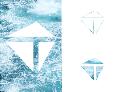
Personal logo
A simple geometric logo that allows for a lot of variations.
I started with two variations (one with outlines, one with the triangles filled in) in black, and quickly discovered the possibilities to play around with colours, patterns or images.
I'm happy to have both a basic set and endless approaches, allowing me to explore and change it up while remaining consistent.
I've always liked geometric designs and the use of negative space. It was important to me to have a logo consisting of several parts that came together to form the whole. I like how the asymmetric assemblage adds a more dynamic feel.
(Background image found on Pexels.co)
Like
