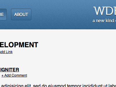
Landing page for a new URL Shortener v2
click here for a full preview: http://cl.ly/image/1F2I3y1t1n23
This is a shot of a landing page I am working on for a client of a new URL Shortener specifically for web development links called "wdev.us"
This is version two. The "wdev.us" section is smaller and the "links" section is more prominent. what do you guys think? what does it need? I need your opinion.
I think it needs something in the way of fonts but I cant think of what that is. Help please!
@Perceval McElhearn what do you think about the update?
More by Ethan Kramer View profile
Like
