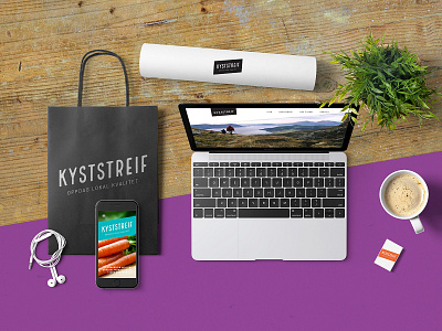
Brand identity for Kyststreif
Brand identity for a group of local business, who are joining forces under an umbrella brand. With such a diverse group of businesses, my main challenge was to create a brand identity that was unique enough to stand its own ground – whilst not overpowering the each company’s existing brand identity. In the end, we landed on a typographic logo, with a twist. The logotype gives associations to tradition and local craftsmanship, but by slanting it we added a dynamic touch. These diagonal lines are carried through to the rest of the brand identity, and coupled with a bold and juicy choice of colours the overall look and feel is far from frumpy. This is tradition brought up to date! The colour palette also allows each participating company to pick the colour that works best alongside their existing branding.
