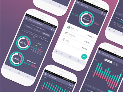
Net Value Doughnut for 22seven
Check out the full project here: https://www.behance.net/gallery/81968285/22seven-Net-Value-Doughnut
If done correctly, we can create causality and association with simple visual cues, like colour, animation and symbols - allowing something as basic as a colour or symbol to communicate something more complex and enabling.
The intention of these designs was to communicate one's financial status and how it's changed over time, whilst prompting the user to take action toward better financial choices or to continue engaging in healthy financial behaviour.
More by Greg Schwartz View profile
Like
