SaaS Homepage Header
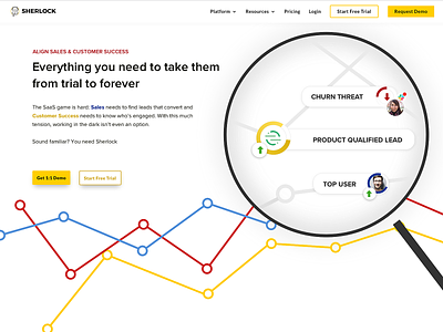
This one was a tough one in terms of the graphic. We needed something not too overwhelming, but that still conveyed the key benefits of the product.
Landed on this giant magnifying glass, which fit with the branding (Sherlock) but also expresses that the product helps you find the important information within your data
Full site: sherlockscore.com
More by mekkie View profile
Like
