Habari App Redesign
Habari App by GTbank Redesign Case Study
Introduction
In November 2018, GTbank launched a mobile app called Habari with the promise that it would be the one-stop shop for everything from music to shopping. However, upon trying the app, it became clear that the interface was poorly designed and many users shared this opinion as seen from their feedback on the Google Play Store. This prompted me to redesign the app, with the goal of creating a more usable and aesthetically pleasing interface. This case study outlines the redesign process.
Research
I started by using the app to gain a better understanding of its features. The current app was found to be doing too much, which made it confusing for users. I identified that the Play section for media, the Shop section, and the Pay section should be the main focus of the app, with other features being sub-features.
Design
Low-Fidelity Designs
I started with low-fidelity wireframes on wireframe.cc, and drafted ideas on what the new Habari app should look like. Unfortunately, the wireframes were not saved, so I moved on to high-fidelity designs.
High-Fidelity Designs
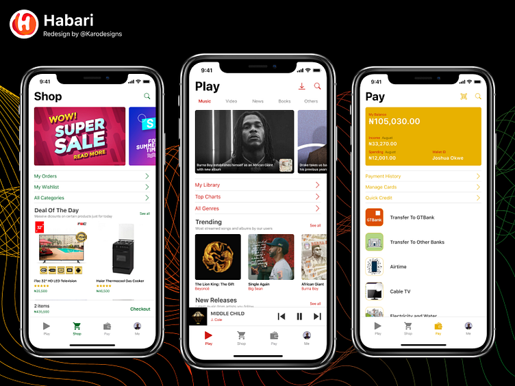
I used Figma for high-fidelity designs, as Invision Studio was not comfortable to use. I chose colours based on each section, with #CE1812 for Play, #006925 for Shop, and #E8B100 for Pay. Each section was separated using a bottom navigation bar, with the goal of making the app feel like three standalone apps.
Play Section
The Play section was divided into three parts: a top section to highlight important or exceptional media content, a middle section with subsections (music library, playlist, charts, genres, categories, etc.), and a bottom section to show trending media and recently added media. The current media playing is shown in a bar attached to the bottom navigation bar, which expands to show media controls.
Shop Section
The Shop section was divided into three parts, similar to the Play section, with the goal of focusing on the spotlight, subsections, and other groups. A bar above the bottom navigation bar shows the cart, and tapping on the bar expands the cart to show full details.
Pay Section
The Pay section was similar to the Shop section, with three parts focusing on the wallet, subsections, and a list of things that could be paid for directly on the app.
Profile
I maintained the design system for the profile, following the same rules already laid out in the app.
Final Design
The final design makes the whole app feel uniform yet clear about each section of the app. I created this design in a way that is not cumbersome while maintaining the many features the app already had and even adding more.
Conclusion
This case study shows how I redesigned the Habari App by GTbank. The redesign process involved research, low-fidelity designs, high-fidelity designs, and a final design. The final design made each section of the app feel uniform and clear, with the focus on the Play, Shop, and Pay sections as the main features of the app.
Read more on Medium https://medium.com/p/66825745981e
