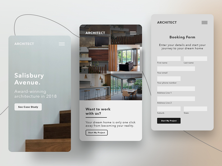
Architect Website Mobile UX & Next Steps Flow
Design concept for an architect's website I'm currently working on.
These guys just rebranded themselves and need to update their old website to appeal to a refreshed upper market of modern renovators and home owners.
This flow of case study aims to always have the "Next Step" right in front of the viewers eyes as much as possible so that potential clients can take the call-to-action easily.
Repetition doesn't go astray so I've included a number of call- to-actions throughout this site inviting the visitor to "Start their project" or "Book a review."
Hope you guys like it! Comment your thoughts or tell me how I can improve this👇🏼
---------
More by Jackson James View profile
Like
