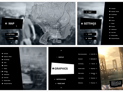
GTA V main menu redesign
The main menu of GTA V is bad. It's hard to navigate, it is impossible to memorize where everything is and it is not consistent with the graphic style of the game. It is just lists within tabs within other tabs.
In this redesign I attempt to make it easier to go through and find what you need by making use of more horizontal space and creating sense of 3d space inside the UI.
More by Star Lederer View profile
Like
