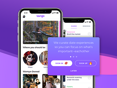
App Delayed Sign Up
Delaying sign up is key for any app to retain their users. You should show your value of your app so users understand why they should commit. This example combines some walkthrough text while the user is in context of the app. Getting hit with full screen walkthroughs can be just a painful as full screen sign in experiences before even seeing the app. However, if you need to provide some context of how your app works and your value prop, this design might do the trick. If the user taps 'later' this prompt can always find them again when they want to complete an action, like 'save' for instance, which would give them a good reason to sign up.
More by Logan DeBiase View profile
Like
