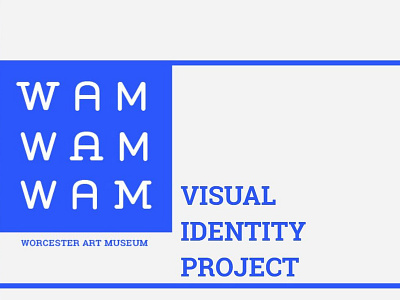
Worcester Art Museum Branding Project
This semester I was tasked to work with the Graphic Design Department of Worcester Art Museum to come up with a redesign for the institution. My visual identity concept was inspired by the text-based logo of The Metropolitan Museum of Art (The Met), mostly for its simplicity yet bold color scheme. While the re branding of the MET sparked controversy among designers and critics, there was no doubt that it created massive and widespread attraction. Moreover, it certainly make use of the short abbreviation. “The MET” adopted widely as a result.
https://www.behance.net/gallery/81368125/Worcester-Art-Museum-Branding-Project
More by Derek K. Do View profile
Like
