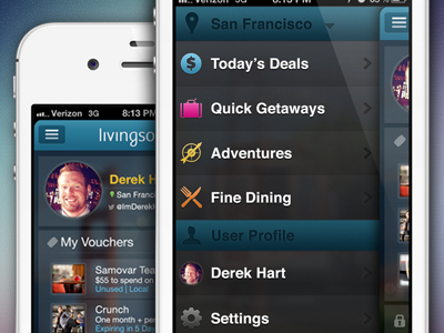
LivingSocial List View Concept
My first rebound! This is a mockup of what the list view could look like to go with the profile page redesign. Still kept the blurry photo background but had to dial it back a bit so the tabs would still pop. Switched up the icons a bit as well and added a section for the user profile. Feedback appreciated!
More by Derek Hart View profile
Like

