Good Company
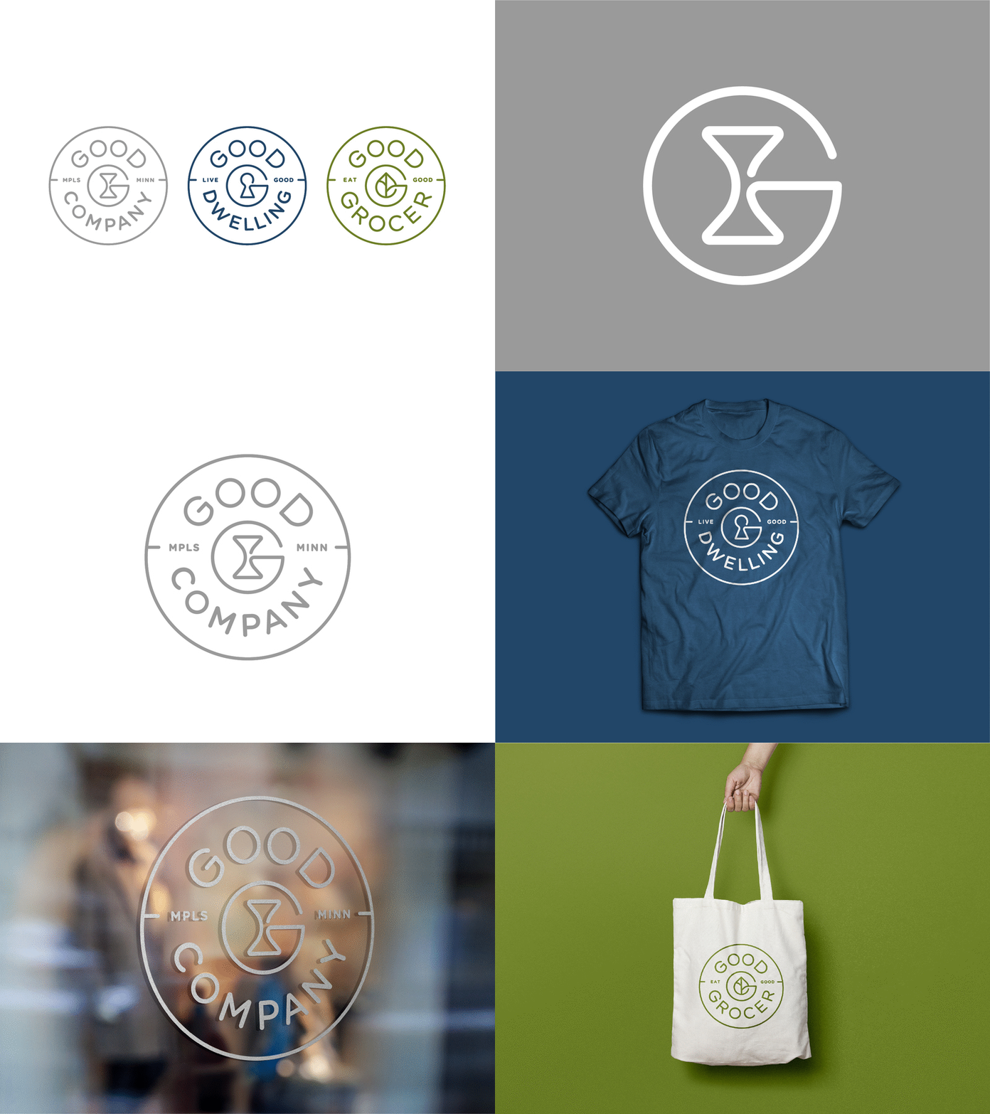
We spent the first quarter this year developing a brand family for Good Company. If you've followed along, I'm sure you've seen many "G" marks and "Good" type treatments in our feed. After many rounds, we finally settled on this system. The icon is a "G" combined with an hourglass for Good Company, a leaf for Good Grocer and a keyhole for Good Dwelling. Both the icons and the naming system was designed to keep the system unified.
Good Grocer is a volunteer based grocery store and Good Dwelling is a condo building on Eat Street in Minneapolis. All of the Good Company brands are focused on joining in and doing good in your community.
If you want to learn more about Good Company, check out the site my good friend Martin Olson designed and coded for Good Dwelling: www.gooddwelling.com
If you'd like to learn more about Peters Design Company, check out www.petersdesigncompany.com


