Palheiro Alto | Grid Structure
PALHEIRO ALTO
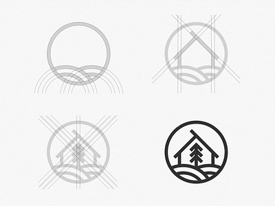
GRID STRUCTURE
Hope your having a great week. So both me and the client agreed that the first option was the best one. It's minimalist but also classy.
For me it's always fun to see the grid structure of other logos and how the designer got there. I think you can learn a lot from it. That's why I've been posting them, maybe it inspires your next project ✊
Now I'll continue to work on finishing the branding. As for the color I think brown would give it a luxury high end feel. But still need to test a few color palettes to be sure.
What colors do you guys recommend? 🤔💭
Have a nice Friday✌