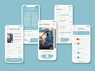
Cinema E-Ticket UI App
#DAY 4
Here my cinema e-ticket design for Iphone X
UI :)
From the user research that I did, I decided to use 3 navigation: movies, location, and users.
The reason I chose these three things is because:
- Movies: users who have not yet decided on the movie they want to see tend to look for the latest movie with a good rating
- Location: users tend to have the location of favorite cinema or any cinema closest to them
- User: to manage his personal account.
Then I started to make the flow and the design.
Enjoy :)
Corrections or suggestions are welcome
More by Mentari Enggar Rizki View profile
Like
