STUDIO/kaarin
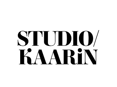
Logo for my new Digital Marketing Studio.
The logo breaks down like so:
The serif shows classy, serious, knows our shit vibes. We're professionals.
The curves of the K and R add femininity. We're woman-owned and proud of it.
And the lower case i initiates the vibe. We want to have fun, don't hire us if you suck, and let's party.
More by kaarin s View profile
Like
