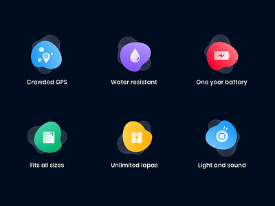
Lapa Brand Colors
Lately, we renewed our color palette.
Our main goal is to reuse these color set as much as possible throughout our different platforms.
For example: Our red/green/yellow are for error/success and warning states on the app, but are also a big plus when it comes to reinforcing the brand - or to attribute a color to a certain mood/feeling.
We also aim to design an entire dark theme for the app so the colours must look marvellous on our #000D20.
Cheers! 🍺
More by Ana Luísa Ferreira View profile
Like
