chopeh
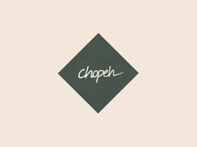
The chopeh logo has been the same for, dramatic music, 6 years.
I'm thinking about actually adding some new work to my website, and giving it a bit of a refresh. Toying with a simple update to make it it little more modern, but for the most part keeping the original type intact (it's just my handwriting).
To the uninitiated it would seem I have simply removed all the garbage around my logo and replaced it with an angled square. And you'd be right.
Certainly not the end of my exploration.