Inline Validation Post
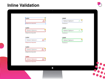
There are various possibilities when using inline validation. We like to make sure that we use validation styling details that are clear enough, yet not obnoxious or over the top.
Here are the styling options we looked at.
Inline validation needs less emphasis than after the fact error messages because people will easily see the error or success as they are still in the same space on the screen.
We selected the middle validation for error states and the top validation for success validation.
Which would you select?
More by UX Design Cravings View profile
Like

