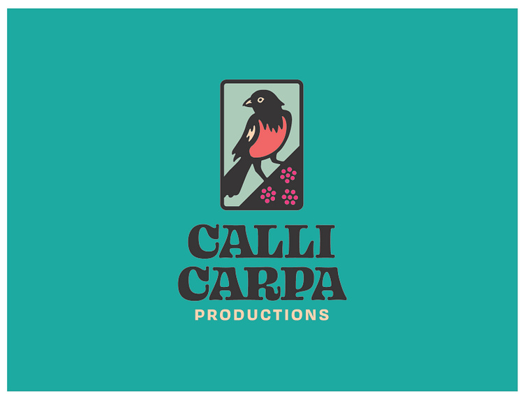
Callicarpa Productions - Branding
For Callicarpa, a boutique music production company, rather than focus on its namesake plant, we decided to create a series of flexible brandmarks centred around the songbirds that feed on its berries. We were tasked with designing a fun and memorable brand that would survive in several extreme contexts, from large eye-catching full-colour posters, to inverted fine print running down the spines of CDs and LPs. We developed a funky retro pattern to represent clusters of callicarpa berries in the logo’s cornerpiece, simplifying from three clusters down to just one for the smaller brandmarks. Fonts used: Ohno Blazeface and Covik Sans, both by the wonderful Ohno Type Co.
More by Alain Champagne View profile
Like
