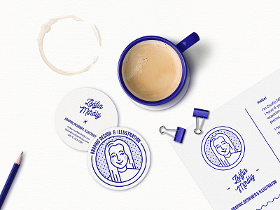
Self Branding - Zsofia Mihaly
I never really had a proper #identity since I started working as a graphic designer, cause I somehow always had other more urgent projects to do. But now I decided to take the time and come up with one that reflects on both my personality and my graphic style.
I did not want to go for a monogram logo, cause I don’t feel that my initials would represent me very well, so I decided to keep my old avatar instead and add a fun looking wordmark to it. (Those of you who follow me for a longer time would know this avatar, cause I’ve created it in 2014 for my BA diploma portfolio.) I was aiming for a fun but professional appearance so I combined the playful logo with minimalistic elements, and settled on one colour for the whole identity.
When I was a kid I loved playing around with my mum’s carbon transferring papers. Loved how monotone yet so colourful my drawings turned out. So I decided to capture that childhood memory in my branding process. I am using only the colour “Pantone Blue 072 C” across all the elements. For me it’s the closest to the blue of the carbon papers we had.
What’s the story behind your identity? Let me know in comments, I’d love to hear it! 😊💕
See the whole project on my Behance: https://www.behance.net/…/83623…/Self-Branding-Zsofia-Mihaly
