Design Tips
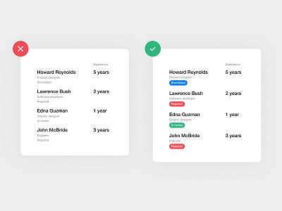
When you highlight some elements of interface with system colours, you don’t only emphasize the attention of the user on them but provides a possibility to scan information faster.
I mean that if you read the text “Rejected” on the red background, in future, you don’t need to read the text. When you see the red tag – you immediately understand that this user is rejected.
Follow me on Instagram for more design tips.
More by Design Masterclass View profile
Like
