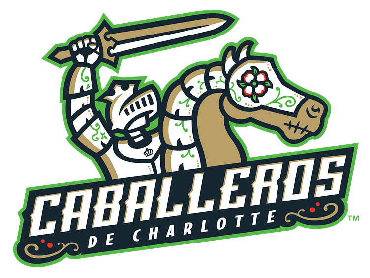
Caballeros de Charlotte - Primary Logo
Primary logo for Los Caballeros de Charlotte brand, taking the field in 2019 for the Charlotte Knights, Triple-A affiliate of the Chicago White Sox. This design carefully incorporates a number of symbols that resonate with Charlotte and North Carolina as a whole but also offer a tip of the cap to Latino and a little bit of Mexican tradition.
Horse - golden palomino, a breed of Colonial Spanish Mustang (NC state horse) brought to America in the 1500s and featured throughout history in art and literature.
Flower - Dogwood flower (NC state flower) with symbolism tied to Christianity and the crucifixion.
Mouth/bones/symbols - loose references to El Día de Los Muertos and calaveras/sugar skulls while incorporating core symbols from the present Knights brand i.e. the knight's armor and the horse's shaffron.
Crown - the city of Charlotte's crown symbol on the chest plate is featured on the city's flag and resembles the crown of Queen Charlotte, after whom The Queen City is named.
Gold Circles - there are 33 gold circles featured throughout the logo to represent all 33 Latin America and Caribbean countries (as recognized by the U.N.) unified in one image.
Pose - the horse is intended to appear as if it's rearing on its hind legs with the Knight yelling, "Charge!" In Spanish, that translates to ¡A la carga! which is a prominent phrase in Caballeros de Charlotte marketing.
