YFC logo draft variation
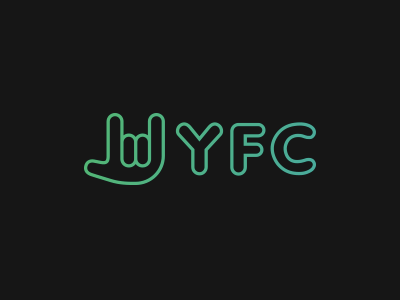
A few tweaks - spaced out the letters more, modified the thumb on the hand and move the position in front which serves both to put the icon first and reversing the hand makes it resemble a lower case "y". Also trying with a gradient treatment on black.