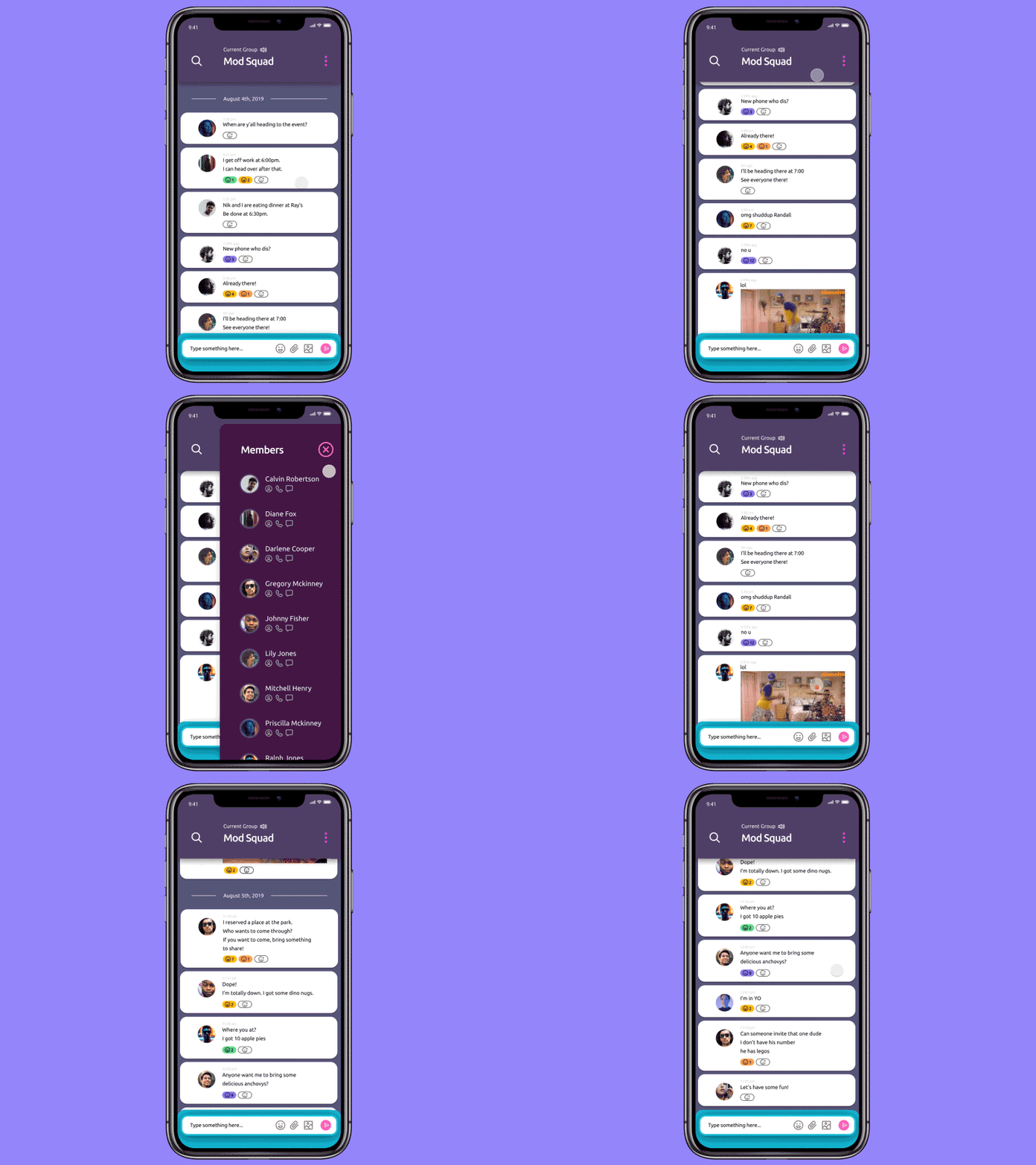
Daily UI #013 - Direct Messaging
Daily UI #013 - Direct Messaging
Lucky number 13, and also the number of my birthday.
For today’s challenge, I wanted to take the opportunity to learn more about Figma. Recently, Figma released plugin integration, and I wanted to learn how to use as many as possible. I probably spent too much time on this, but I don’t regret it.
Also, another goal I had for this challenge was to try to solve problems with group chatting in today’s social media ecosphere. Chatting, in general, has become very streamlined and unified throughout most experiences. However, the group chatting experience leaves more to be desired for some devices. To be specific, group chatting on iPhones continues to cause aches and pains for most users. The main problems I have personally taken note through conversations and personal experience are as follows:
1. Specific groups are sometimes hard to find, especially when they contain similar combos of people.
2. Some group chats can get very annoying, but there is no way to mute them.
3. Sometimes people don’t respond to asked questions because they assume someone else will speak for them.
4. When you miss one thing in a group chat in can be incredibly hard to find where to start reading from.
I tried to solve as many of these issues as I could with the visual design. However, some solutions are only conceptual as I didn’t have enough time to mock everything up. The solutions are as follows:
1. Create a naming system for groups that would be client-side only. Groups could then be customized and arranged however the user sees fit. Groups conversations and private conversations would then be separate instead of included in the same list.
2. Included with the UI proposed above, there would be an option to mute the chat that could be toggled on or off.
3. The emoji voting system’s goal is to generate data that determines which part of a conversation is noteworthy or controversial. The system will also encourage more users to participate in the conversation. Vote tallies are located under the text, each user has one unique vote per text bubble.
4. This concept is more abstract, but using the data gathered with emojis, an algorithm would determine which parts of the conversation are noteworthy. The user could then quickly jump to each section depending on what they wanted to see.
--
Follow me if you want to keep track of my progress on the challenges!
Your likes and views give me courage.
More about the design challenge:
https://www.dailyui.co/
