Brimstone Hotel & Spa
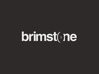
Brimstone is a luxury hotel and spa based within the Lake District. A brimstone itself is essentially a wheel with a square cut out of the middle. When I last visited looking at the original logo I thought I would have a go at situating a perspective Brimstone in place of the O in stone. The original logo is very similar using regular weighted Helvetica. I chose to use bold which I believe is more impactful, and slightly spread out the kerning to distinguish the letters. Whether or not this is considered an improvement to the original it was certainly a challenge and I'm happy with the way it came out!
More by Cailum Earley View profile
Like
