Toggle
Hi friends,
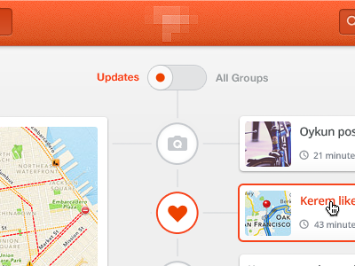
Here is the toggle lets you switch between Updates view in timeline style and Group list view in grid style. Big group block at the left, list of updates for the group at the right.
I'm guessing you will comment about giving depth to toggle, but why not using it flat and clean like this? I'm liking this (today).
Comments are very welcome as always. Cheers,
Ps, why not following me on Twitter today.
- - - - -
Update #1:
I just attached inner dark shadow version, any better?
More by Oykun Yilmaz View profile
Like

