SITKA Gear Catalog & Email Template
I was recently asked to put together a few designs for a catalog article and email template for a test project of sorts for SITKA Gear.
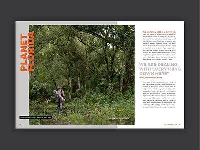
I was tasked to take some of the awesome photography that they have from their various freelance photographers and pair it up with copy from an article that they already produced.
I've hunted in some gear from SITKA for the last few years and it's what introduced me to a layering system for when you're out hunting. I thought I'd take that approach with the overall design to mimic the concept of layering throughout.
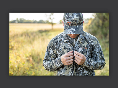
You'll see an example in my mood board of the tracing paper spread that overlays on the the spread below. Image four and five are inspired by that same idea. I want to be able to show the copy and info about each piece in the photo but then you can reveal the photo underneath without type to distract from the product.


