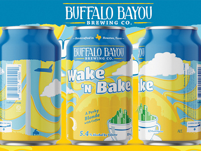
Wake 'N Bake Beer Can
Wake ‘N Bake was a tough one to take on; sometimes the direction has already been cemented and you have to find ways to massage an idea you may not be 100% behind. The client was happy with the design used for the tap sticker of the previous year’s release and simply wanted to “get that on a can”. The core concept of the coffee cup and sun were must-use icons, and the color palate was originally free to play with, but then was directed specifically very early in the process. I still tried to exercise a little creative freedom in terms of tint and shade shifts of the colors and their placements. I adjusted the hues of yellow and blue to create interest and energy while keeping the overall weight of the design light and in tune with the focus of the design.
