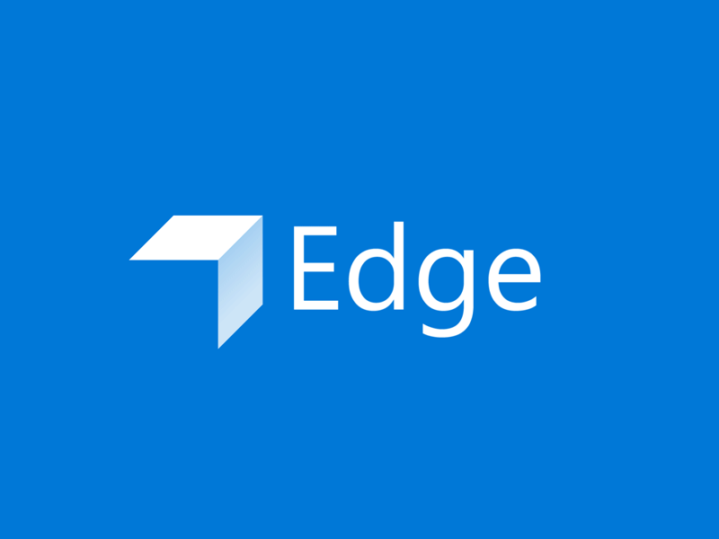
Simplistic Microsoft Edge Logo Concept
Decided to finally bust out Illustrator and After Effects again to create a logo animation. I set off about a week ago to create a new redesign concept of the Microsoft Edge logo. After having racked my brain, creating about a dozen of overly-complicated logo concepts of all shapes and sizes, I finally sat down today with a pencil and paper and came up with this simplistic final draft.
Although the logo may not be the most original concept, it was specifically designed with symbolism in mind. The logo can be perceived as the right Edge of a cube, or an arrow pointing north-east, to symbolize moving forward, and/or searching onward (browsing the internet).
My idea was to create a re-brand that would distance the browser from it's past, and give the Chromium version of Edge it's own face for the future. Moving the logo on from it's signature "e" was one of my main concerns, as I felt that that was a big factor as to why it was held back, due to the fact that it was so similar to Internet Explorer and it's ill-fated past.
Of course, this is purely a concept, but I hope you enjoyed! Thanks for reading.
