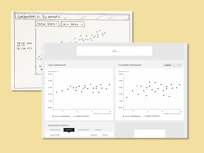
Comparison tables, sketch vs final design
The final designs ended up a bit simpler than the original concept-- which would have allowed for some filtering.
These designs are circa 2015, for my client Mansion Global while I was at Substantial. (This entire project was a responsive web app, but I find the desktop screens are more interesting to showcase this for this project!)
More by Liz Heidner View profile
Like

