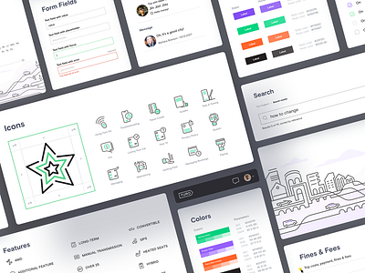
Turo – Support portal UI kit
Hey guys, we’re glad to share some thoughts and results from our recent collaboration with Turo.
It was an exciting project for us that came with the responsibility of fixing a growing problem that Turo was facing. We were tasked with improving Turo’s support experience. It was difficult for users to find the information they were looking for, which led them to create more and more tickets for the support team to handle.
Our goal was to improve the UX and adjust some visuals to transform the support page into a more helpful, appealing and easy-to-navigate experience. Our back-end team executed constructive UX revisions and our front-end team developed new functionalities — such as an auto-suggest within the search field feature which displays practical suggestions to users questions.
During the redesign, we created a consistent iconography and illustration at the bottom of the home page. We also improved the navigation and the information architecture.
As a result, the improved support portal provides users with the ability to find the answers they’re looking for in a 'self serve' manner. The number of people who enter Turo’s ‘contact us’ flow (akin to creating a ticket) decreased by roughly 30% — a hugely positive outcome for all involved.
It would not have been possible without the great people from Turo who supported us throughout the project. We’re grateful for the opportunity to have created a better experience for their customers.

