Equity Layout System
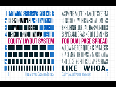
A modern solution to the ages-old problem of page layout. Reminiscent of the canons of yesteryear, designed specifically for ledger/ANSI B/A3 spreads.
The Equity grid system partitions pages into 44 sections, horizontally, vertically, proportionally. Simple, flexible, divisible.
Page contents start 6 squares from the sides and bottom, and 3 squares from the top and the middle of the spread. Ephemera and marginalia have their place in the page borders, set in by 3 squares.
Laid out with plenty of math and love in Maine ♥️ Set in Tungsten with Solarized colors.
More by Kim Slawson View profile
Like
