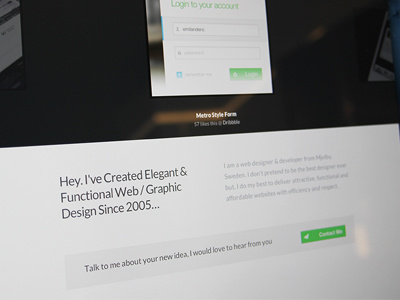
New Clean Portfolio Website
Okay, so now I have redesigned my portfolio from scratch AGAIN because it had no feeling to it. I usually design with heavy textureres and have almost always aimed to the typical iphone / imac style. Now I'll try something new and I'm happy with that decision. I tried to stick to a minimalist style with a little more color to some elements. And I have to mention that the contact form is still under development. What do you think of my new design? :)
Live: http://emils.me
More by Emil Andersson View profile
Like

