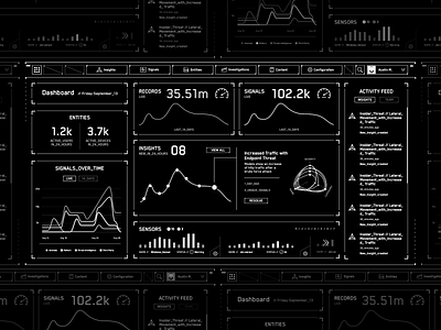
HUD Concept Wireframe
Early in our design process, we experimented with different HUD layouts using a grid to rearrange data. We used black and white to force feedback on information architecture and UX.
While this particular design didn't work out everyone unanimously loved the black and white color scheme. So much so that we almost rolled with it for production.
More by Harlan Elam View profile
Like


