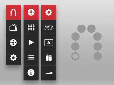
Slingbox Menu
Playing around with ideas for an improved Slingbox UI/UX for the iPad. Thought process was to keep it simple and standardize the menu controls throughout.
Selecting an item provides that items sub contents (e.g., Main > Settings). Tapping on the parent item (e.g., Settings) returns you to the previous menu.
View full size for a better look.
More by Daniel Filler View profile
Like

