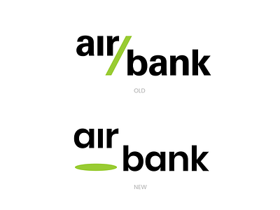
AIR BANK LOGO REDESIGN
So I'm starting a new project. It's called "Logos of top banks in Czechia but in diffrent parallel universe". Ok I'm joking.
The point is I wasn't really ever astonished by bank logos.
I always found them boring and not interesting but I get the profesionalism in them.
Soo I'm redesigning top 5 banks in my country and this is the first one.
I left the notorious lime green in there as it just belongs to the brand. People know that green. I wanted to be more playful, I tried various ideas but this one was wininning from the start. It is simple still could be used as bank logo not too crazy, subtle. People could recognize the brand even only the green oval, shadow. And that is big + and another step to symplicity.
If you want to see more of this check out my instagram.
Let me know what you think, if you like the OLD or NEW logo.
Have a nice day!
