How are you?
How are you?
I'm doing pretty good.
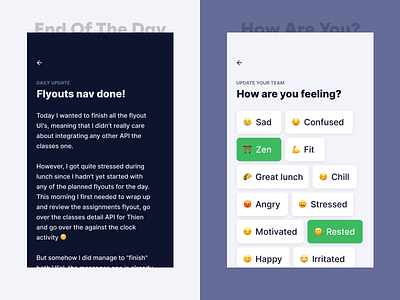
After launching the beta of tomeru.co we are improving some some ux issues.
We are mostly focussing on the mobile version because this feels still a bit buggy.
The idea is to show all fly out navs full screen, so it feels more robust, and we use all the screen real-estate that's available to use.
We are giving white space, margins some more love because they deserve it.
If you have no idea what tomeru is, and you are working remote? You should read our story:
More by MOIJ View profile
Like
