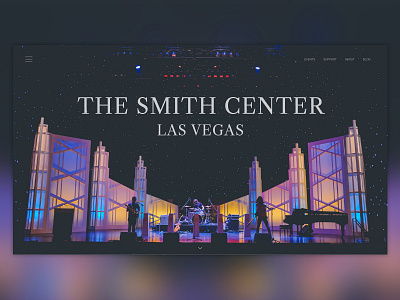
The Smith Center - Day 2
Day 2 - For the month of August I am challenging myself to do a piece of design content every day. This exercise will push me to sharpen my skills and speed up my workflow at the conceptual stages of design.
Second design is a concept landing page for The Smith Center for Performing Arts in Las Vegas. I wanted to design to put the focus on their beautiful facility and put the performing arts front and center.
After pressing the top left burger menu the user would be treated to a sidebar overlay which would display full site navigation. Or they can use the Quicklinks on the minimalist header to jump straight to the hub pages for each category.
Fonts: Caslon, Univers
Photo Credit: NeONBRAND on Unsplash
-N
More by Nick Simmons View profile
Like

