Coherent Color System for Illustrations
An integral part of our process is defining a consistent color palette for complete project. From icons to buttons to text to illustrations, they should all work together.
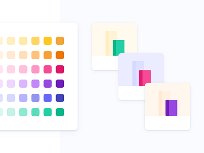
This shot showcases how we created a coherent color system to base our illustrations on while creating a ton of them for Stairway. Because we needed to create a wide set of illustrations, we ensured our palette was flexible enough for creative freedom and achieve the goal of each illustration, clarify even more.
--
Amazing design created by the @Yummygum team