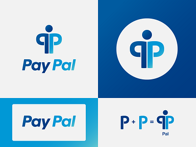
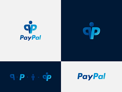
Paypal - 2nd proposal
This is a rebound of the main logo design concept.
There was some discussion about the icon. Someone mentioned that it might be better to have straight letters.
I disagreed and still think the first one is the better choice, but I uploaded this version so everyone has the chance to see and decide which one would be the better choice.
Any input and comment is welcome.
More by Helvetiphant™ View profile
Like

