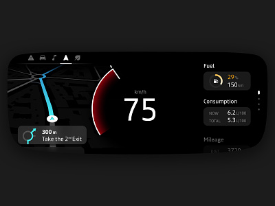
Car cluster⎢Redesign concept
What could be the futur of Renault's cluster?
----
Disclaimer
This fun project helped me to get hired by the Renault design team✌️
----
After analysing the instrument clusters of the latest Renault range (Clio, Captur, Zoe...), I first decided to divide the interface into 3 parts (from left to right): widgets, speedometer and car informations.
Then, I removed all unnecessary Ui elements and focused on improving visibility and readability.
I believe that a minimalistic approach while prioritising the most important informations is relevant because, in a non-autonomous-driving situation, it helps the driver having a quick look at the cluster while he focuses on the road.
----
Check out my design process: thomaschevillotte.com
More by Thomas C View profile
Like
