Neat Group - Logo Concepts
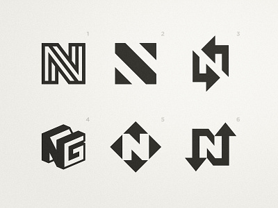
Recently i've been developing the new brand identity for Neat Group, a company that links professionals in need of outsourcing services with service providers. They are responsible for quality, deadlines and seamless communication 💼 Here's a brief explanation of the six concepts: 1. Bent bar forming an N - there was a high association of the brand with flexibility, associated with the services provided, and the bent bar has a high correlation to that 2 / 3 / 6. N + Arrows - the arrows represent the growth, speed and the linking of professionals 4. Tridimensional NG - representing a solid and trusted company 5. N + Arrows + Chat Box - my favorite concept because it not only represents growth, speed and the linking of professionals but also communication due to the minimalist chat boxes Now that you know the rationale behind them, which one do you prefer? 🤔