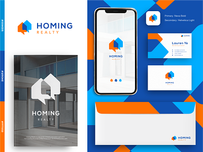
Homing Realty Logo Concept
Hello Dribbble,
How are you there? Hope you enjoy my post here with the concept of Homing Realty Logo.
Since it is an app logo which helps real estate customers and agents, I incorporate two chat boxes and houses on the logo. It obviously represents the conversation between the customers and agency with the houses or real estates as the object of conversation.
The color of blue gives it the feeling of trust, confidence, and reliability. At the same time the orange feels much more warm, welcome, and friendly.
It just suits the purpose of the app, trustworthy and friendly.
That's all about my presentation
Feel free to comment
Cheers :)
More by Ardiann Fauzi View profile
Services by Ardiann Fauzi
Like
