Daily UI 006 - User profile
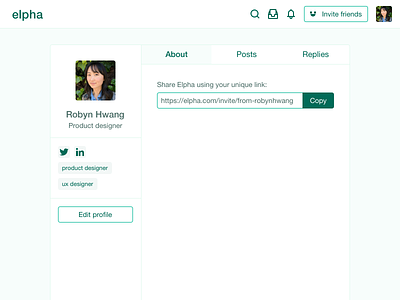
For this challenge I did an unsolicited redesign of Elpha's user profile page. No shade intended! I know actually implementing things is different from throwing up a 2D picture.
About
Elpha is a place for women in tech to connect, and I've been mostly enjoying it so far. The creators seem to be putting a lot of thought into how it's built. If you want an invite, sign up below! (I don't get anything for it except an online badge at 10 referrals, if you're curious.)
Process
I used the basic elements already used in the UI, but made the color contrasts more accessibility-friendly. I also made containers to house the elements a little more neatly.
Again, this page is probably super low on the priority list because the comment threads are the meat of the platform. So this is just a quick exercise to imagine what it could look like someday.
