Daily UI 005 - App icon
Step 1
The challenge was to design an app icon. I went to redesign an icon for an app that I use frequently and love, but wished had a little more pizzazz in its branding: Player FM.
It's a podcasting app for Android, and while very functional, the app icon tends to blend in with all the others. Seems like they all go for the "three curved lines emanating outwards like radio waves" look.
See podcast apps on Google Play
Step 2
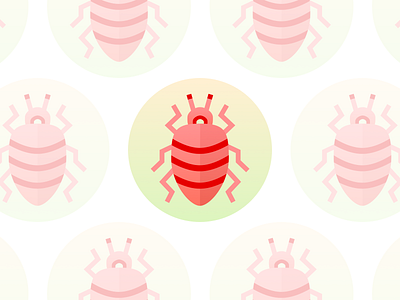
I decided to repurpose those three curved lines — a compromise. Animals are always good, I thought. They're cute. Memorable. They have personality.
I searched for animals that exist in large numbers, since the joke now is that there are a bazillion podcasts out there. Anybody can start one! I'd be lying, and you'd be lying, if we said we'd never considered it.
Turns out, insect species are the most numerous. I'd initially wanted something a little cuddlier, a little friendlier, like my favorite podcasts tend to be, but insects are pretty cool too. Especially beetles. Plus, insects have antennae, which I believe is a radio term. (See, I'm all ready to start my own podcast.)
Step 3
I kept red as the primary color, but toned it down and added some gradients and details to stand out from the pack. I found some pretty sweet inspiration on Dribbble as well, as always:
@Tatiana Bischak — Jewel Beetle
@Jennifer Hom — Beetle
Let me know what you think!