Food + Flower
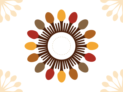
I also took a few passes at scrapping the old logo shape altogether and building something using the old one as inspiration. The concept: food + flowers.
Tried to make the most out of the white space. Spoon flower with fork florets and a plate as a central disk. Also kept with the original site colors since this is a dramatic change and I'd still want people to be able to make the connection between the old branding.
More by Jesse Gardner View profile
Like
