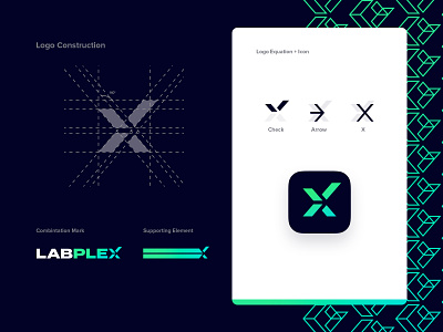
Labplex Cover Dribbble Behance Leyvaski
Check out the full case study on Behance —
https://www.behance.net/gallery/83422505/LABPLEX-Brand-Identity
LABPLEX is a professional team that has over 10 years of experience testing marijuana and edibles, LABPLEX is poised to provide you with unparalleled marijuana lab testing services in the Southern California area. They are opening their new lab in Long Beach, September 2019.
I was hired to create a new website and a Corporate Identity for LABPLEX. I was aiming to create a logo that appealed to other business owners in the cannabis industry. I also had to create an identity that looked professional, appropriate, and trustworthy.
I wanted to create a visual identity that was a genuine reflection of what LABPLEX represented.
The new wordmark design has a bolder sans serif font to demonstrate a straight-forward, simple, and mature attitude. It also indicates a sense of honesty and sensibility.
This wide sans serif font displays an innovative and methodical feel. This width is hardly noticeable, so it could also be used as a modern font. There is also a sense of strength with its extended letterforms.
This spring green color has a strong emotional correspondence with safety, science and approval/permission; much like a green light at a stop light.

