Daily UI #007 - User Settings
Initial Thoughts:
For this round I didn’t want to make a typical settings screen, I wanted to make something different and more relevant to my needs. Sticking with the Shaper branding system I determined that the best experience to build would be a workout companion/tracker, and the settings could be edited within that experience.
Design:
I used the Strong Lifts app (https://stronglifts.com/apps/) as a reference for what type of content to include, then I started furiously wireframing. After I had the flow down, I started building out the screens for prototyping.
I borrowed some visual elements from the second challenge, specifically the progress bar, but developed them further. I felt the color choices I was using previously were a tad too dark for UI design, but I am glad I had this opportunity to experiment. I think the UI I created for this round is much closer to a real product.
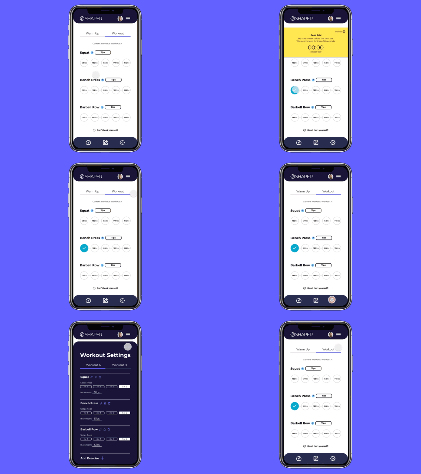
To quickly explain the functionality of the page: There is a tab on top to toggle between your warmup and your work out. Each exercise has a tooltip and a “Tip” button that would show a modal on how to lift properly, possibly animated gifs to quickly show correct vs incorrect techniques.
When the user clicks the settings button, a modal will slide out from the bottom of the screen covering the content. Here the User can edit specific details about their exercises including renaming, deleting, editing reps/sets, changing weight increments, and downloading a cell sheet.
Aesthetically, the settings experience would be a darker UI to differentiate where the user is in the app. I am planning on giving menus/settings a darker UI throughout the design system.
Takeaway:
Generating content is far too time-consuming, from now on I am going to use pre-existing products, services, or apps as reference points. I feel I will get more out of this challenge if I spend more time designing, instead of writing.
--
More about the design challenge:
https://www.dailyui.co/
