Beta 2.0 - Jupiter Launch
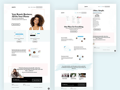
We've been focused on building the product so my attention was turned off the .com. After some time of feedback pilling up from this first iteration I put in some time to refresh the .com to sell the product a bit better.
I had done some personality explorations which I had posted here and after some time and talking with one of our customers, it ended up in this final direction.
I wanted it to feel premium, and I think the second exploration was going in that direction, however our customer noted they wanted to feel "relaxed." So, I took a few of the style nods from my previous exploration and then added in some lighter treatments in colouring, image selection, and texture selection.
More by Helen Tran View profile
Like
