Cryptocurrency Landing Pages and Blockchain Interfaces Design
Voted by the public on CSSDA:
— BEST INNOVATION — BEST UI DESIGN — BEST UX DESIGN — SPECIAL KUDOS AWARD
ESSENTIAL DESIGN TRENDS, JULY 2019 BY WEBDESIGNERDEPOT
8 "Twists" of the project
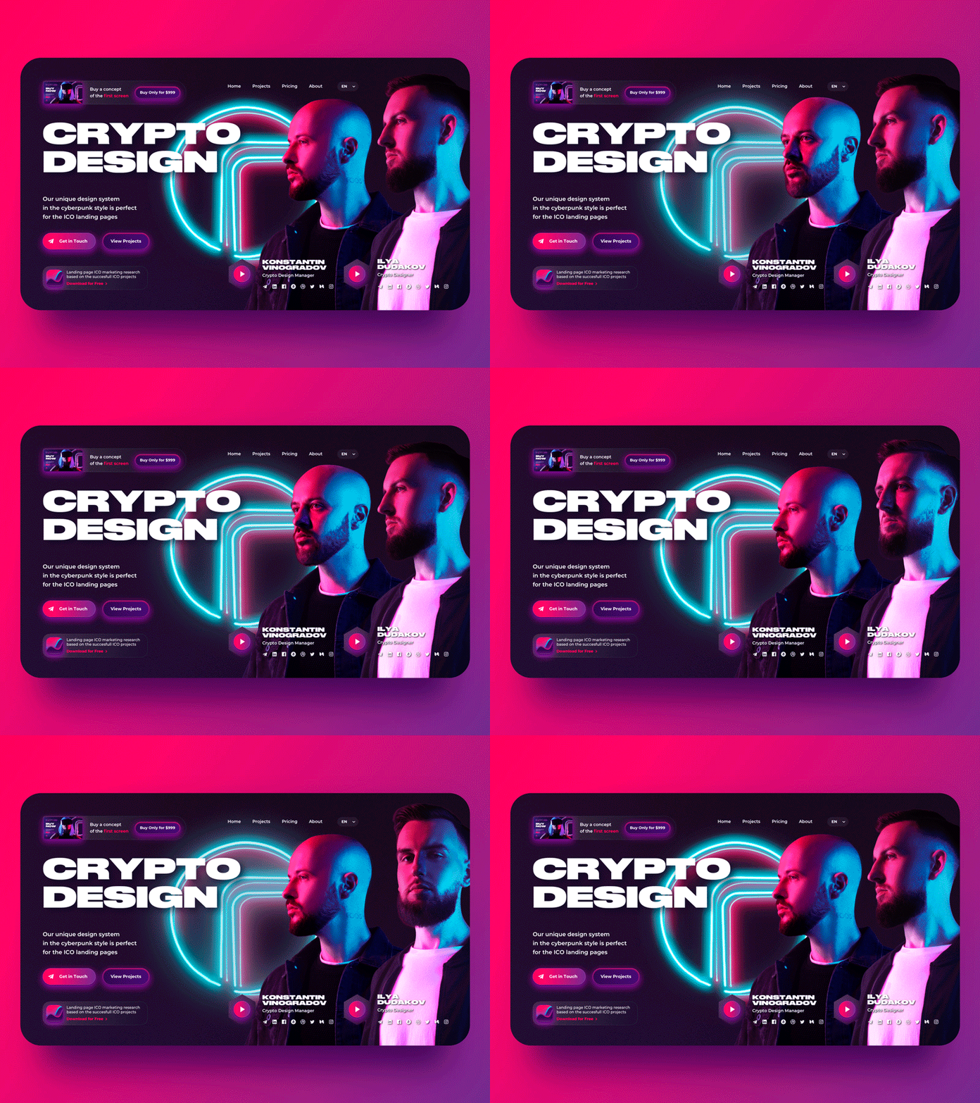
Design # 0 The design has been made with the latest design trends of cryptocurrency projects and it shows the expressive outbreak of the technological world. While creating the primary concept, we focused on the futuristic aspects of blockchain technology. To make the long story short - cyberpunk!
Positioning #1 Be in my crew We all belong to various groups, "crews." Some of them we choose by ourselves. We care more about people like us. The "Crypto Design" title on the page reflects our values, putting aside the unobjective consumer. We're taking in our "members" and say without fear "No" to strangers!
Marketing # 2. The single-screen pages showed their worth and advantages a lot of times, cause of the lack of scrolling. It allows to the user concentrate all the attention on the OFFER yes/no form
# 3. There's conversion element posted in the place of the logo, bringing up to one action - to make an order
#4. Old-school communication methods are not available - only a telegram! 90% of our members use it entirely. Yes, there are some risks of missing a potential customer who prefers other kinds of communication. "No problems" it's the primary adequacy filter.
Visualization #5. The main part of the brain is involved in the perception of visual information. it's brought up by people's faces, as they are recognized most fastly. Connected with desire of the ancient brain to save us from danger, so you gotta identify the enemy and decide what to do - to run away or fight to the finish. The "faces turning" on the webpage - your brain automatically reacts on moving elements.
Look direction # 6. The characters's look on the webpage directs attention to the objective action — to make an order.
Interactivity # 7. Interactive helps emotional connection with the product and creates a "wow" effect.
#8. The "forefront" members of the team are represented with links to all social networks and the additional factor of trust - all videos in different languages
And now... 1. Open https://roobinium.io/ 2. Look at it for 5 seconds. 3. Close your eyes and the neon image will be printed out before your eyes.
Made by @Konstantin Vinogradov and @Ilya Dudakov
How did we produce it? Backstage project https://www.behance.net/gallery/83084055/Cyberpunk-Style-Self-Promo-roobinium-Single-Page
